UX Design, Writing & Research
Screenshot 2024-01-23 at 02.03.24.png

Issuu: Improving user engagement

.

Issuu: Improving user engagement

Objective

To improve user activation and feature usage through improving our product’s information architecture.

Results

Significant growth in user activation and usage increases of more than 100% for multiple features.

Background

I began redesigning core aspects of Issuu’s information architecture in 2022. As a UX design lead, I had been given design ownership of Issuu’s core creator experience. It was my job to lead and grow our design team, as well as take a hands-on role in designing solutions that would improve engagement from Issuu creators. It was also my job to align design objectives with KPIs of different product managers, engineering teams, and members of senior leadership.

Headquartered in Palo Alto, Issuu has offices in Copenhagen, Berlin, and Braga (Portugal). Its leadership team is distributed between Europe and the United States, and most of its employees, particularly on the product side, are located in Europe. In my own work, I needed to coordinate with stakeholders in all four of Issuu’s locations to ensure that design solutions were properly conceived, tested, approved, and implemented.

Problem

Not enough new Issuu users were successfully uploading and publishing documents, sharing their work, and checking their statistics. Users who do not complete these essential steps are not considered fully activated. They are also far less likely to interact with more advanced features that drive retention and revenue for the company.

Users required simpler and more contextually relevant ways to discover Issuu’s features and functionality. Issuu as a buisness also needed to better convey to new users the value of Issuu’s unique feature suite without disturbing the workflow of existing users — Many of whom have been loyal to the platform for many years.

Concept 

Issuu is a platform that helps creators and businesses transform static, scrollable documents like PDFs — from brochures, to whitepapers, to magazines — into web-friendly digital flipbooks, articles, and social media posts for easy online sharing. Founded in Denmark in the mid-2000s, it’s a respected brand amongst independent publishers, real estate brokerages, educational institutions, and creative professionals, among others.

Issuu’s primary source of revenue comes from monetizing creators through upsell for greater storage space and additional features on paid plans. While the platform continues to expand its capabilities, a legacy codebase and a history of engineering-led norms can pose a number of challenges, as well as opportunities when undertaking initiatives to improve the features, functionality, and overall value of the platform.

Through several ongoing design initiatives, we have been able to improve users’ ability to navigate and move through the Issuu SaaS platform, and in turn improve engagment with important features and functionality. Within some parts of the product, we have seen over 100% improvment in feature engagement after making key design changes to the product’s information architecture. We have achieved this by making key value propositions earlier in our user journey, simplifying our product’s core navigation, and reducing the amount of context switching required in order to edit and share content.

Understanding and Observing 

As the capabilities of any software product expands, surfacing value to users about the right features, in the right place, and at the right time becomes an increasingly complex task. In turn, so too must the methods of evaluating the journey of that product’s user base. We needed to better surface the value of Issuu’s many features, while also conveying their value in relation to other features so that users could better connect their goals with the capabilities of our product. This also had to be done in a way that did not bump into too much legacy code in order for enhancements to be delivered within a technically and financially feasible timeline.

One of the core design changes required in order to reach these goals was to rethink and redesign key aspects of our information architecture.

Our core challenge in improving Issuu’s information architecture has been working out ways to thoughtfully chunk out each change so that it can feasibly be implemented by delivery teams. This also needed to be done while keeping the core product recognizable and visually consistent for Issuu’s existing user base. A helpful analogy is to think of our work as similar to renovating an important roadway while drivers still need to drive on it.

Also like roads, software platforms age. Ocassionally, the flow of traffic needs to be rerouted for the benefit of everyone. In the long term, it’s nearly always a positive. In the short term, however, managing that change is a delicate process, where important tradeoffs have to be made and clear priorities set. To begin breaking down key information architecture opportunities, our design team started by constructing flow diagrams of our product in its existing form. Then, through reviewing a mix of both qualitative and quantitative insights, we documented the most consequential user pain points, as well as where they were happening in the broader user journey.

These painpoints were uncovered through many hours of careful customer interviews, usability tests, and consolidation of documented user feedback from our customer success team. Much of this work I did personally, and much more was done in collaboration with Issuu’s UX researcher, who is one of my direct reports.

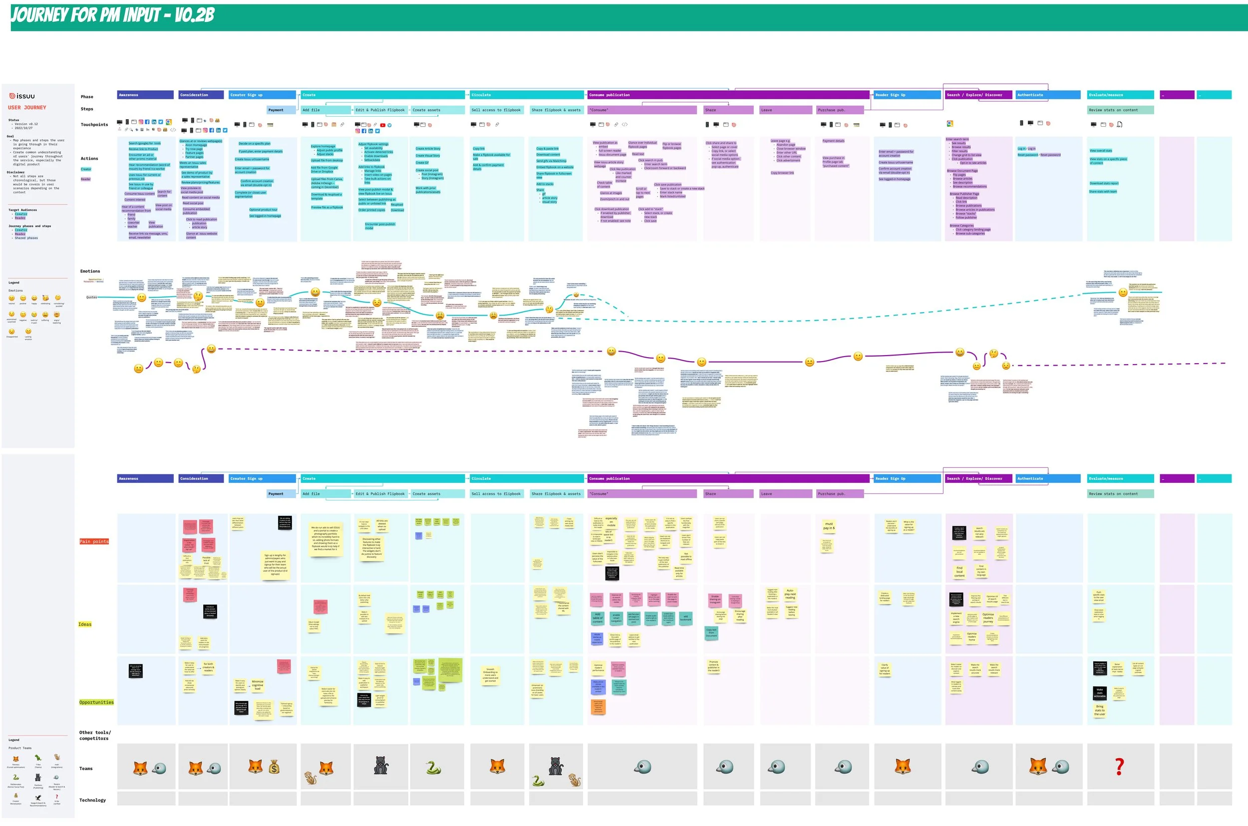
I worked with my co-lead (Issuu has two UX leads) and our user researcher to construct a journey map where we pinpointed key moments of both user delight and user discomfort. Numerous quotes were matched to specific pages and other touchpoints within the product. Several major painpoints, as well as many ideas on what to do about them, were plotted onto different sections of the journey map. We also labelled which delivery teams would have ownership over developing any potential changes we may see a need to make.

Journey map
Planning and prioritizing

Another beneficial aspect of our journey map was that it helped us visualize which parts of our user journey we had collected the most and the least qualitative data. It was noted that uneven concentrations of qualitative data needed to be accounted for in some way. It also helped our design team better understand which parts of our product lacked adequate user feedback. To challenge our own biases, a contractor was briefly hired to audit Issuu’s current information architecture. We compared her notes with our own, and were relieved to discover that we had independently located, identified, and defined many of the same pain points and opportunities.

Given the number of of opportunities for improvment that we identified, we recognized that enhancing Issuu’s information architecture would be a long-term objective involving many projects, not just one. Some projects also involved more technical and design dependencies than others. For that reason, we grouped our many ideas into three high-level goals which I began sharing with stakeholders. They were as follows:

1. Earlier value propositions that highlighted key features and functionality.
2. A simplified publication workspace that made adjusting publication settings easier and more intuitive.
3. A more consistent editing experience where users did not have to do as much context switching to adjust different kinds of content.

These goals were then broken down in to several smaller initiatives that could be owned by specific delivery teams. To ensure we were prioritizing the right initiatives, we scheduled meetings with a wide range of stakeholders, from individual customer success agents all the way up to C-level executives. All of their input was documented and factored into our prioritization. We also continued developing our ideas as a design team. A summit was organized, and designers from all of our offices met in Berlin to collect and review additional qualitative findings, user pain points, and bold ideas. All ideas were attached to a printed version of our user journey, and then incorporated into our digital version.

Design summit in the Berlin office

Journey map with additional annotations from designers and their product managers (left) and high-level design objectives (right)

Many learnings were gathered during our design summit. The findings from designers and their cross-functional teams heavily informed the prototypes we developed in the coming weeks and months that would go on to fundamentally change how Issuu users engaged with our product.

To ensure that ideas for addressing user pain points were ultimately feasible, proposed design initiatives that would affect our product’s information architecture were shared early on with product managers and tech leads. We learned in our conversations with these and other stakeholders that many of our architecture proposals would take some time to implement, due to a mix of technical debt and other pressing product objectives that were competing for some of the same engineering and design resources.

Some of the pain points we discovered began before users even entered our product. The team identified through several rounds of usability testing and user interviews that that many people coming to Issuu’s website for the first time did not accurately comprehend what the product did and what benefits it offered. Many more than expected were signing up based on the recommendation of a friend or colleague who had already used the product and liked it. It was often information from word of mouth — not the information they were getting from Issuu’s website — that in many cases was motivating new users to sign up. Reputation and brand recognition were masking the shortcomings our website when it came to unpacking features, functionality, and value for new users.

The major pain point here was that many users failed to comprehend what Issuu did from the website alone, and many who did sign up up for the product would quickly drop out — too many people misunderstood how Issuu worked and then onboarded into the with expectations that it did something else. Changes to the website could address this pain point and were also less costly and time-consuming than making changes deep within our core product. Also, if we created more clarity and motivation at the beginning of the user journey, we may just see a higher activation rate — one of our key objectives in making changes to our information architecture.

In order to have the maximum amount of impact in the shortest amount of time, our product team agreed to prioritize work on high-level design objective number one: Early Value Proposititions and its corresponding design initiatives, with the aim of increasing user activation.

Competitive analysis and first designs

In response, the design team proposed several design changes to Issuu’s website, as well as to the Issuu homepage for logged-in users. All designs were heavily informed by industry standards and best practices observed on similar SaaS platforms. It was with this awareness that the team designed a top-bar navigation that directed users more efficiently to our feature pages. They also designed a Recent Work section on Issuu’s logged-in homepage that reduced the number of clicks required to access and edit content. Additionally, we designed new shortcuts that allowed users to share documents, preview their work, and check the performance of their content with far fewer clicks than before. Users would encounter earlier value propositions that highlighted key functionality earlier in their user journey, and more often.

Top bar navigation (left) Recent work section (middle) and publication list shortcuts for sharing, statistics, and viewing live content (right)

Within the core product, years of stacking actions in our lefthand navigation had made it difficult for users to locate and recognize importnant features. Many local navigations resembled a global navigation, confusing users. Our team designed new interactions for several key areas of the product in order to simplify our main navigation, group common actions more contextually, and more clearly show leaders the happy path that would help them reach their goals. All of these different redesign efforts were then broken down into a series of independent initiatives, which we presented to engineers, product managers, and our executive team. In our presentation, we took great care to juxtapose old designs and new designs side by side to make certain improvements more apparent.

Due to the dependencies that many of our architecture changes created, it was agreed with engineering managers that our primay architecture changes be broken down into several smaller initiatives. These “bridge initiatives,” as we called them internally, broke our efforts into a leaner, more manageable series of chunked-out releases with specific success criteria. With each release, we were building a bridge to the larger information architecture vision we were aiming to reach. Each part of the bridge, of course, was still implemented in an agile way. New learnings always had room to alter any design if there was ever a need. Our first bridge initiative to be implemented was our top bar navigation. It’s delivery was accompanied by an even bolder design release — a new page that allowed users to preview their converted files without having to create an account on Issuu.

Earlier value propositions

The idea of designing a preview before signing up idea conceived in a brainstorming session of both product managers and UX designers. Historically, Issuu users could only see their converted files after first creating an account with Issuu. they could then upload a file and see it converted into a digital flipbook. It took several more clicks and a lot of context switching to see how variants of the same file looked in article format, as a social media post, or as a gif. For this reason, many users never engaged with these content types or even lacked any clear awareness of their existence. If more people could experience their converted files before the account creation process, however, this might motivate them to sign up for Issuu and keep exploring the product. The theory was that this motivation would contribute to increasing our activation rate.

The design for the preview before signup was conceived as part of a greater redesign of Issuu.com. My team completely redesigned the website’s homepage and added the ability to preview your converted files without creating an Issuu account. The latest top bar navigation changes were also incorporated into the design. This was understood as a need from our qualitative research findings, mentioned earlier, based on the fact that many visitors to the Issuu website were struggling to understand exactly what Issuu did and how it worked in many instances. Many users also did not understand what types of files could be converted, so we clarified that in our new design. All UX copy was created in collaboration with our marketing team.

Most important of all, however, was that our new website design prompted users to upload a file right away. It also allowed users to preview their converted files in different formats without creating an account. This was an attempt to not only tell website visitors what Issuu could do for them, but actively show it in the context of their own files.

Top of redesigned Issuu website with upload CTA as the primary action

Text section highlighting key steps in publishing journey

Text section highlighting key features and the value they provide

After uploading, we designed a new journey where users are taken to a page that automatically shows them their converted document file as a flipbook. Just like when a logged-in user is uploading a file to Isuuu the conversion only takes a few seconds. With this new page, anyone website visitor who can upload a file can also quickly preview their converted document in five different formats on a single page — showing exactly what content creation possibilities exist on Issuu with minimal clicking and context switching.

Previewing your converted file as a flipbook

Previewing your converted file as an article

There are also a series of actions that users can take to edit their content. Each action results in a modal appearing. The modal explains that the user needs to first create an account if they are to edit, publish, or share their converted content, regardless of the format. When testing the initial prototype, most users expressed appreciation for a quick overview of what Issuu could do with their files. When asked to create an account in order to take further actions on their content, most accepted this as a fair ask, and one that they were expecting to see at some point.

Flipbook preview (left) and modal that is activated when a user without an account tries to make edits (right)

Measuring success

The preview before signup flow was first launched as an AB test. In the test, the old version of our website that did not contain an ability to upload and preview files without first creating account was tested against our new design that did. What we observed was that users who went through the new flow were far more likely to publish a flipbook, share it, and check their statistics. They were activating and upselling at a higher rate than users who went through the old flow. Our hypothesis proved to be correct. Show value ealier, and the user will be more motivated to keep exploring the product. Showing the functionality of the product earlier also appeared to be helping people better understand what Issuu’s features could provide them. Several months on, we are able to conclude that the activation rate for new users was dramatically higher than it was before enabling new users to preview their converted documents before signing up to Issuu.

Simplified publication workspace

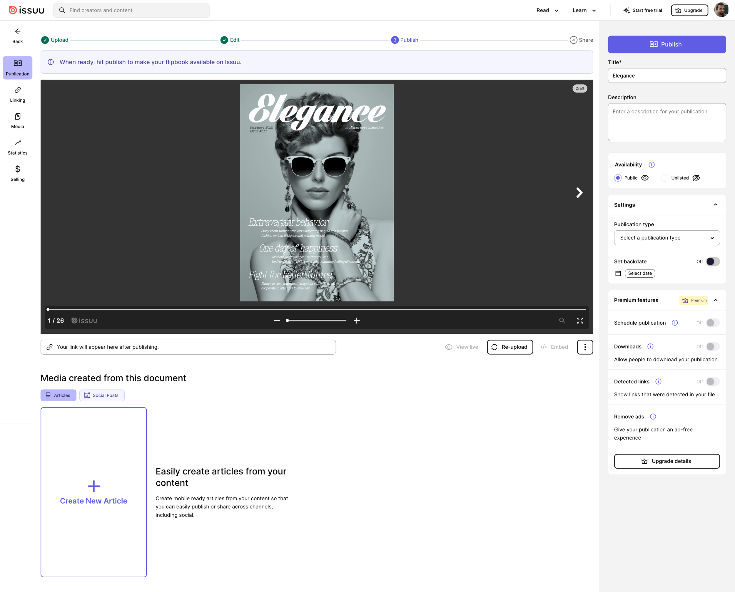
We had successfully motivated more users to create accounts and publish their content on Issuu. Next, we also needed to remove a great amount of friction within our core product in order to improve feature engagement. To that end, the next thing we did was ship designs based on our second design goal of having a simplified publication workspace. In our redesign of the workspace, we unified how users shared their content in different formats and significantly reduced the amount of menu items in our lefthand navigation from 17 to 7. We also concentrated all settings to the righthand side of the screen and introduced a step counter that showed users how far along they were in their publishing process.

Another major change we made to our publishing flow was to make users aware that they could add clickable links to their flipbooks before they published them. We also directly asked users if they would like to create clickable links out of the web urls detected in the text of their documents.

If the user decided that they wanted to add links later, they could always do so after publishing the initial document, and publish the additional changes they made later on.

The other forms of content that could be created besides a flipbook were also made easier to interact with by populating them right underneath the flipbook, which was now possible with our flipbook settings moved to thee right.

Measuring success

Changes to the publication workspace saw significant increases in feature engagement. For some features, engagement more than doubled. We also observed a substantial increase in the formats in which users shared out their content. The consolidation of some actions and the removal of less important ones from our lefthand navigation assisted in improving both feature engagement and our overall publish rate. When paired with more defined publishing steps, we appear to have made it easier for users to complete the actions that they value most. We have also established clear and consistent UI patterns that can be replicated in other parts of our product that we aim to enhance in the future. All of this was made possible by taking a holistic look at our product and leveraging our journey map as a means of prioritizing which pain points to focus on first when revising the product’s information archetecture.

Reflections and next steps

Our information architecture work is still ongoing. Changing the information architecture for our landing pages, our core product, and for our user’s onboarding journey has been a unique design challenge. It has also been a unique organizational challenge. Making our information architecture changes a reality has required better communication with our user base as well as better internal communication with a range of different internal stakeholders. As a leader, it has been rewarding to have opportunity to both enact greater organizational change, and increase the UX maturity of both our product and our company as a whole.

Our strategy of showing an earlier and clearer value propostion and concentrating on producing a simpler publication workspace to users has proved to be a successful way of improving user engagement. Even so, there are still many more initiatives to implement if we are to unlock the full potential that a more connected platform can provide for our users and for our business. That starts with the continued commitment to improving our product’s information architecture. We will continue to look for opportunities to showcase value earllier, simplify navigation within our product, and reduce the number of steps a user has to take in order to experience the full value of Issuu.